The line chart in Google Sheets is one of the basic charts of Google Sheets. Line charts in Google Sheets are suitable for when you want to represent data that changes over processes, stages, and time. Then through the chart we will see the change of the value of each time more easily and objectively. The following article will guide you to draw a line chart in Google Sheets.
Instructions for drawing line charts in Google Sheets
Step 1:
First of all, we open the data table interface available in Google Sheets, or create a new data table.
Step 2:
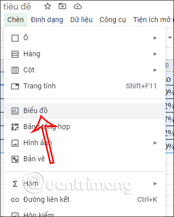
Then you highlight all data areas in the table and then press Insert, choose next Chart to draw charts in Google Sheets.
Step 3:
By default, Google Sheets will automatically detect the data type and immediately apply the map style in that data. Usually a bar chart will be used, but you can completely change the line chart.
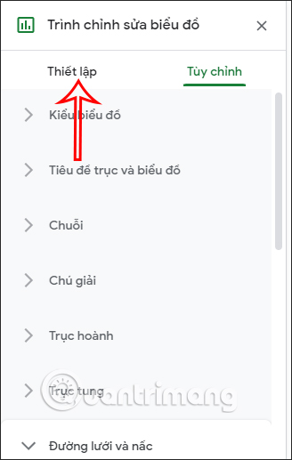
You double click on current column chart and then a custom bar will appear on the right edge of the screen, click Settings item.
Step 4:
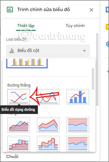
In this section at section Chart Type you click on the list and then scroll down to the style line chart and select the chart type you need to use.
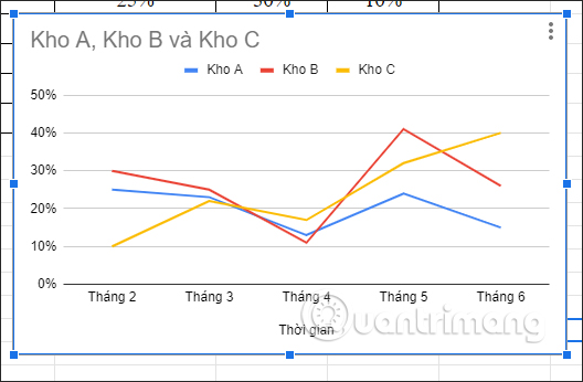
As a result, we have a line chart displayed in Google Sheets as shown below.
Step 5:
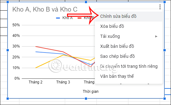
For change the display interface of the chart in Google Sheets, you click on the chart and then select 3 dots icon and press Edit chart.
Step 6:
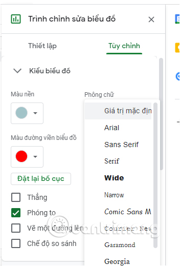
Switch to the chart interface editing option on the right edge, click Custom item.
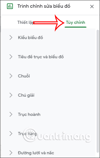
Now you can change the display interface of each chart when clicking on each different item in the Customize interface.
Source link: How to draw a line chart in Google Sheets
– https://techtipsnreview.com/