How to draw a chart in Excel? GhienCongListen will guide you in this post which is extremely easy to understand and follow. If you don’t know yet How to draw a chart in Excel then read this post immediately to “pocket” extremely cool tips that not everyone knows for your chart.
How to draw a chart in Excel
Create data
With any charting in Excel, the first thing you need to get a chart is a table of data. For spreadsheets that already have data to draw, you can skip this step.
Advertisement
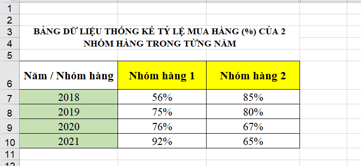
The ready-made data sheet should have enough data, numbers and the names of each part so that Excel can easily understand and create a reasonable chart for you. You can refer to the sample data below:
Advertisement
Create a chart
After you have yourself a data table with all the necessary information, you will come to the chart creation step, the second step of how to draw a chart in Excel that we share with you.
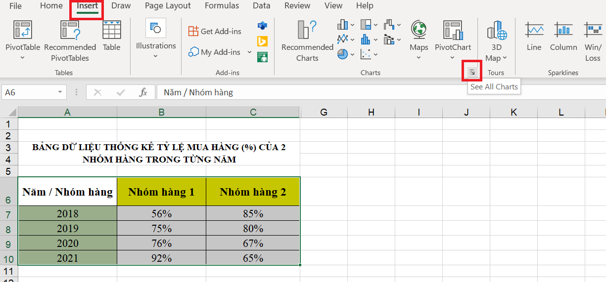
Step 1: Black out the data to create the chart. On card Insertyou choose the arrow to expand in Charts.
Advertisement
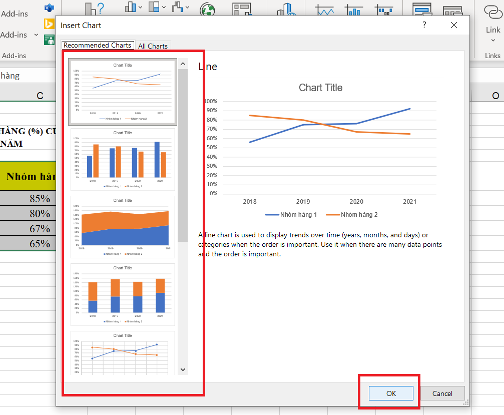
Step 2: A menu appears, choose the appropriate chart type and press OK.
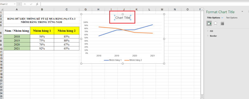
Step 3: After pressing OK, the chart will appear next to your data table. You double click on the line Chart Title to add a title to the chart.
Change chart type
If you’ve already selected a chart type but need to convert to another chart type that’s more suitable for your calculation and comparison purposes, do the following:
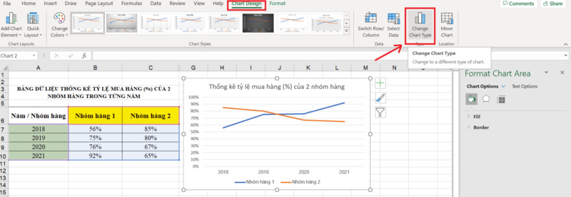
Step 1: Click to select the newly created chart. Go to card Chart Designselect Change Chart Type.
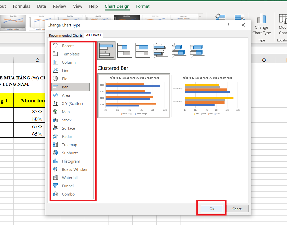
Step 2: In the left column, you choose a chart type you want to switch to. When clicking to select any chart type (Column, Circle, …), in the middle of the menu will let you choose the appropriate chart type. Finally, when you are satisfied, you press OK to complete.
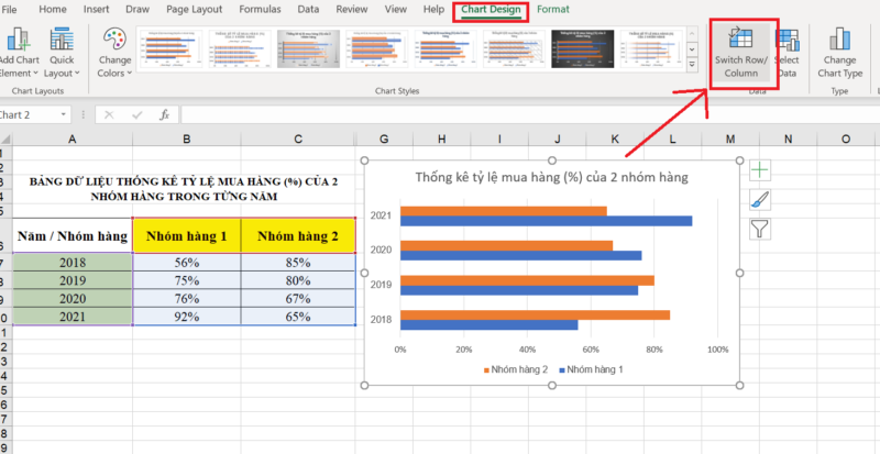
When pressed OK, you will see your chart has been converted successfully. How to draw charts in Excel as well as this conversion will help a lot in your work.
Convert row/column data
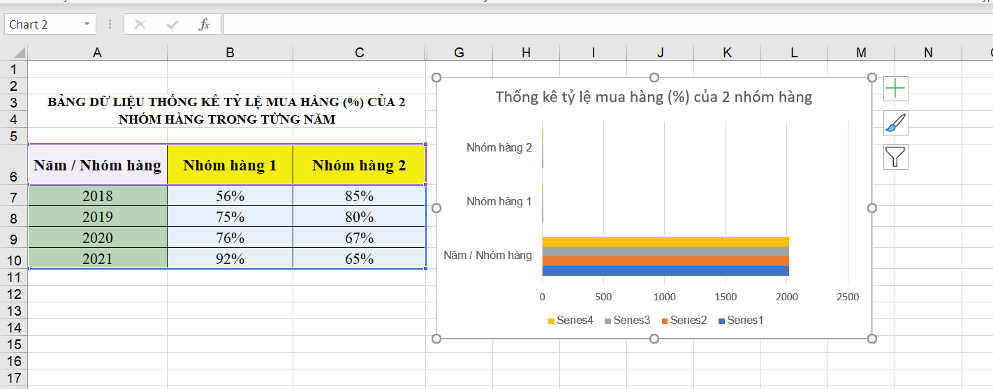
Similar to converting chart types, the first thing you need to do when you want to convert your data from columns to rows or vice versa, you also need to click on the chart and go to the tab Chart Design. However, you do not press select Change Chart Type but choose Switch Row/Column.
Result after clicking:
Caption settings
Annotating in a chart will make your chart much easier to understand, clear, and logical than without a legend. For how to draw a chart in Excel, this annotation setting, you just need to click to select the chart, find the plus sign (+) green (Chart Elements) and check Data Labels:
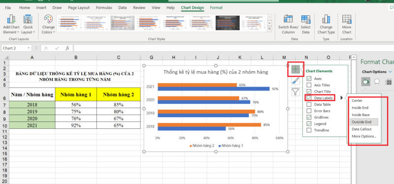
You can also choose where this annotation appears by clicking the black arrow next to the item Data Labels. So it only takes less than 10 seconds, you have an extremely detailed and coherent chart right away.
Adjust your data layout and colors
Think Excel only has a white background, two orange and blue colors for your chart? Are you afraid that your chart is too boring and not attractive enough for listeners? Then you are wrong.
You can completely change the color of the data columns in the chart, even the layout, arrangement and background color are completely customizable. To do this, just click on the chart and go to the tab Chart Design.
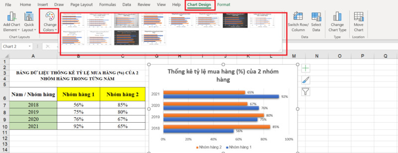
When you press select Change Color, you will be able to change the color of your data. If you want to change the layout or background color, choose between the layouts available in the largest section on this card.
Title for your graph
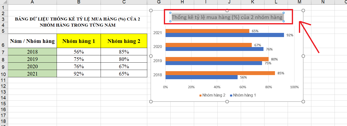
As instructed in the first steps of how to draw a chart in Excel, you just need to double-click on the line Chart Title (when created) to add a title to your chart. So what if you want to change the title? The answer is that you still do exactly the same thing.
That means you just need to double-click on an existing title and you can edit it to your liking.
Note before drawing a chart in Excel
Not any data table Excel has the ability to convert into a chart successfully. This depends entirely on the user’s actions when creating the table. To ensure that your data table fully meets the criteria for charting in Excel above, you need to pay attention to some points such as:
- The content in the data sheet should be clear: Your data table needs to have full column names, row names, names of elements (e.g. Row group 1, 2020, 2021, …). This helps Excel to fully display the necessary elements on the chart.
- Need to agree on format and units: The data in your cells need to be consistent with each other in terms of format (number, date, …) and units (%, kg, mm, …)
You can also find and read more GhienCongList posts about this category:
With a full and detailed way of drawing charts in Excel that GhienCongList sends to you, drawing charts is no longer a barrier between you and Excel. Don’t forget to visit GhienCongListen more often to discover more interesting things.
Source: How to draw charts in Excel that experts haven’t told you yet
– TechtipsnReview


