A chart is a tool you can use to communicate data graphically. Including a chart in your presentation allows your audience to see the meaning behind the numbers, making it easy to visualize comparisons and trends.
Types of charts
PowerPoint has several chart types, allowing you to choose the chart that best suits your data. To use charts effectively, you will need to understand how to use different charts.
PowerPoint has many different types of charts, each with its own advantages. Column charts use vertical bars to represent data. They can fit many different types of data, but are most commonly used to compare information.
- Line graph Ideal for showing trends. The data points are connected by lines, making it easy to see whether values are increasing or decreasing over time.
- Pie chart makes it easy to compare rates. Each value is displayed as part of a circle, so it’s easy to see which values make up the overall percentage.
- Bar chart work like column charts, but they use horizontal bars instead of vertical bars.
- Area chart Similar to a line chart, except that it includes areas under the line connecting the data points.
- Surface chart allows you to display data on a 3D panorama. They work best with large data sets, allowing you to view multiple types of information at once.
Identify parts of the chart
In addition to chart types, you will need to understand how to read charts. A chart contains a number of different elements – or sections – that can help you interpret data.
Insert chart
PowerPoint uses a spreadsheet as a placeholder to import chart data, just like Excel. The data entry process is pretty straightforward, but if you’re not familiar with Excel, you might want to review the lesson: Cell Basics.
How to insert a chart
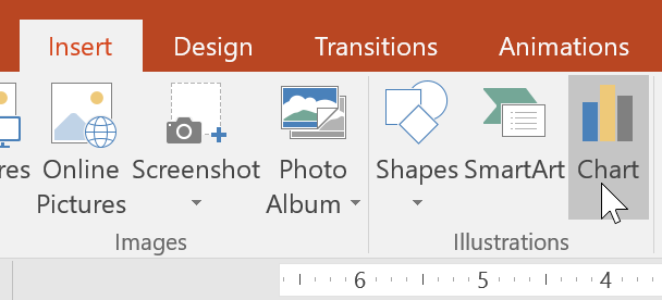
1. Select tab Insertthen click command Chart in group Illustrations.
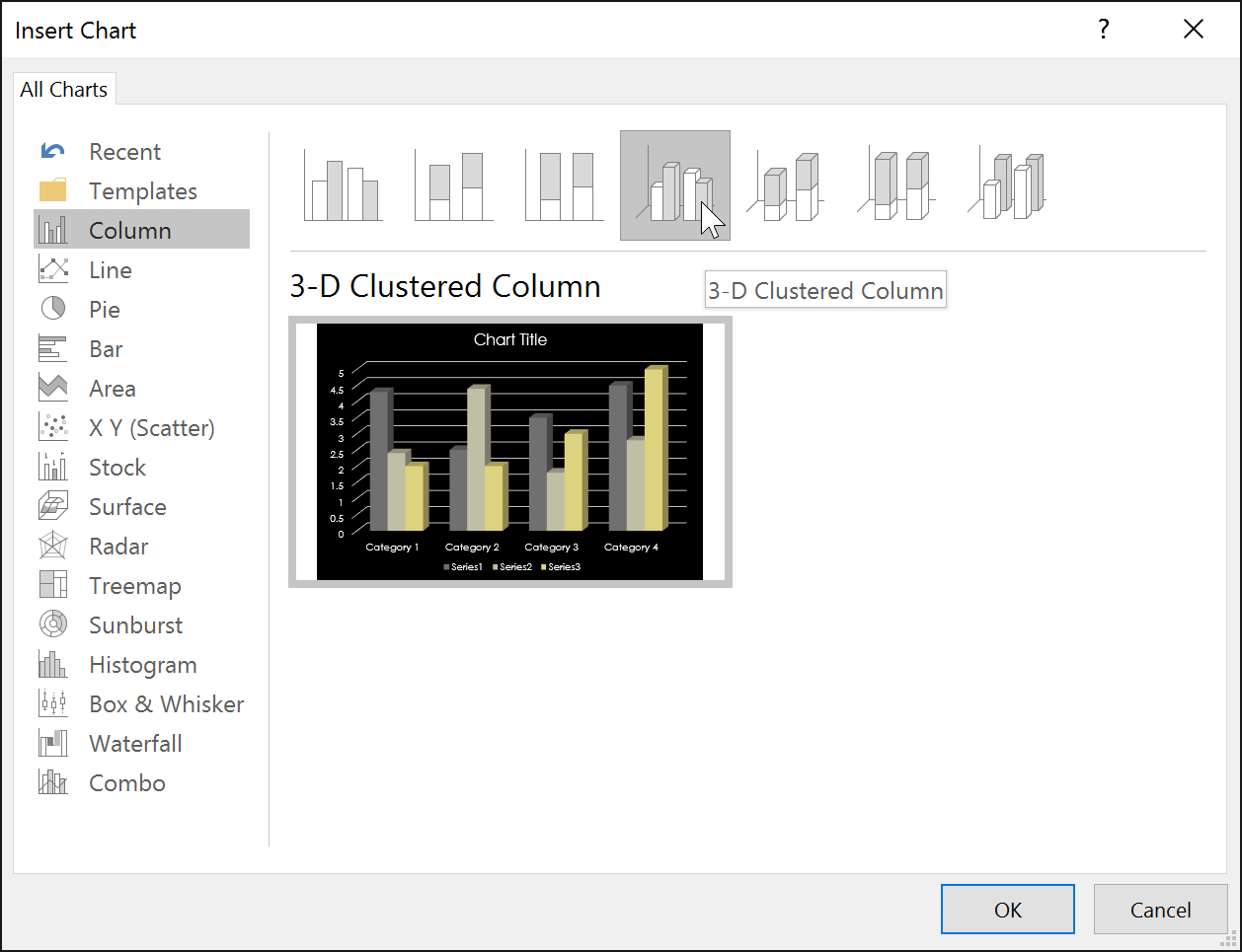
2. A dialog box will appear. Select a category from the left pane and review the charts that appear in the right pane.
3. Select the desired chart, then press OK.
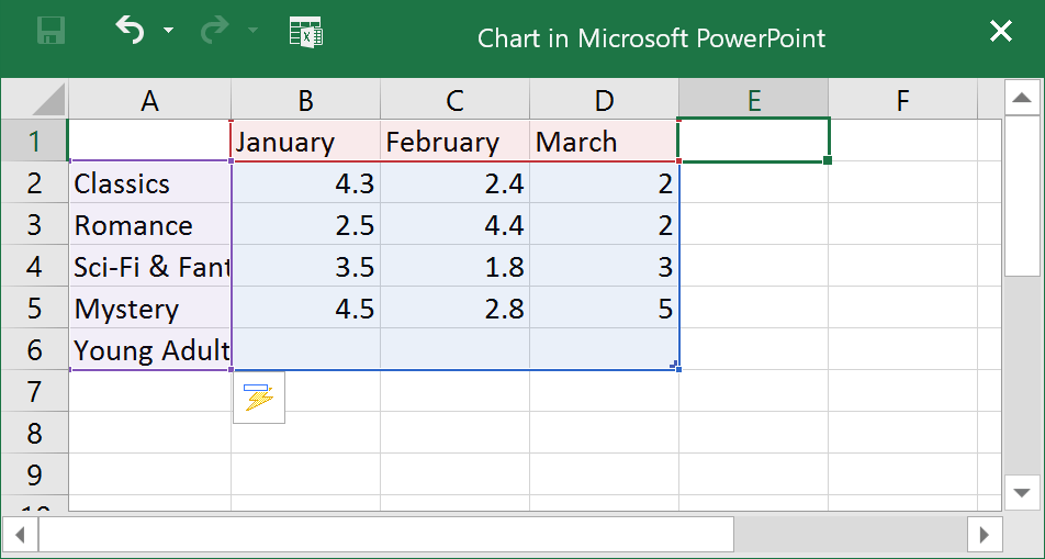
4. A chart and spreadsheet will appear. The data that appears in the spreadsheet is placeholder source data that you’ll replace with your own information. The source data is used to create the chart.
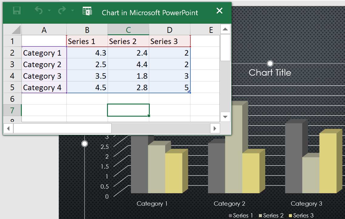
5. Enter data into the worksheet.
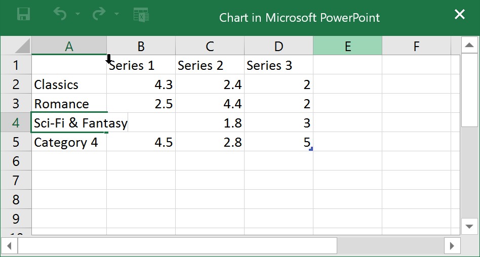
6. Only data surrounded by blue lines appears in the chart, but the area will automatically expand as you continue to type.
7. When you’re done, click X to close the spreadsheet.
8. The chart will be completed.
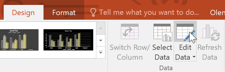
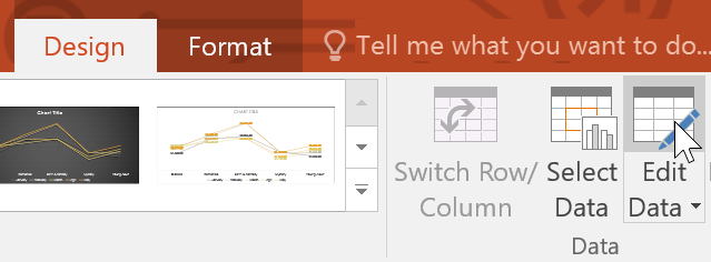
You can edit the chart data at any time by selecting your chart and clicking the command Edit Data on tab Thiết kế.
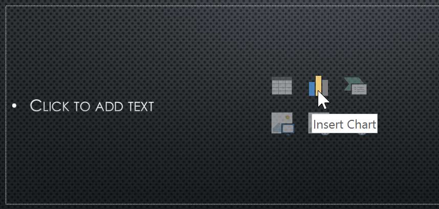
You can also click the command Insert Chart in the placeholder to insert a new chart.
Create charts with existing Excel data
If you already have data in an existing Excel file that you want to use for the chart, you can transfer the data by copying and pasting it. Simply open the spreadsheet in Excel, select and copy the desired data, and then paste it in the source data area for the chart.
You can also embed an existing Excel chart into your PowerPoint presentation. This can be useful when you need to update the data in the Excel file and want the chart to update automatically whenever the Excel data is changed.
Modify charts with charting tools
There are other ways to customize and organize the charts. For example, PowerPoint allows you to change the chart type, rearrange the chart’s data, and even change the layout and style of the chart.
How to change chart type
If you find that your data doesn’t work with a certain chart, you can easily switch to a new chart type. The example will change the chart from a column chart to a line chart.
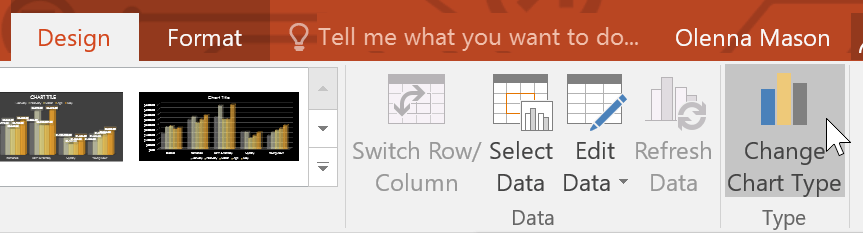
1. Select the chart you want to change. Tab Thiết kế will appear on the right side of the Ribbon.
2. From tab Thiết kếclick command Change Chart Type.
3. A dialog box will appear. Select the desired chart type, then press OK.
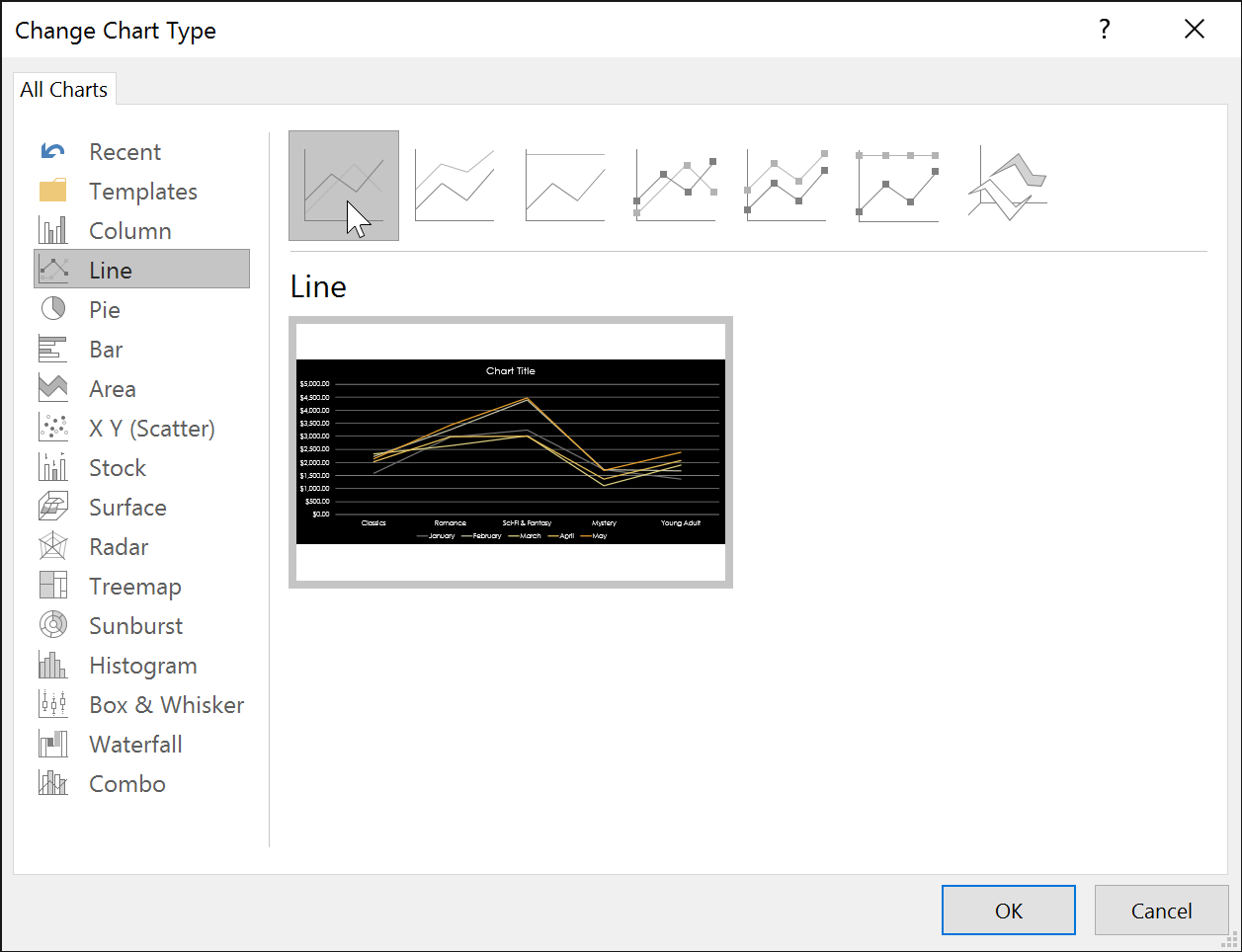
4. A new chart type will appear.
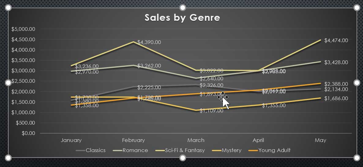
How to convert row and column data
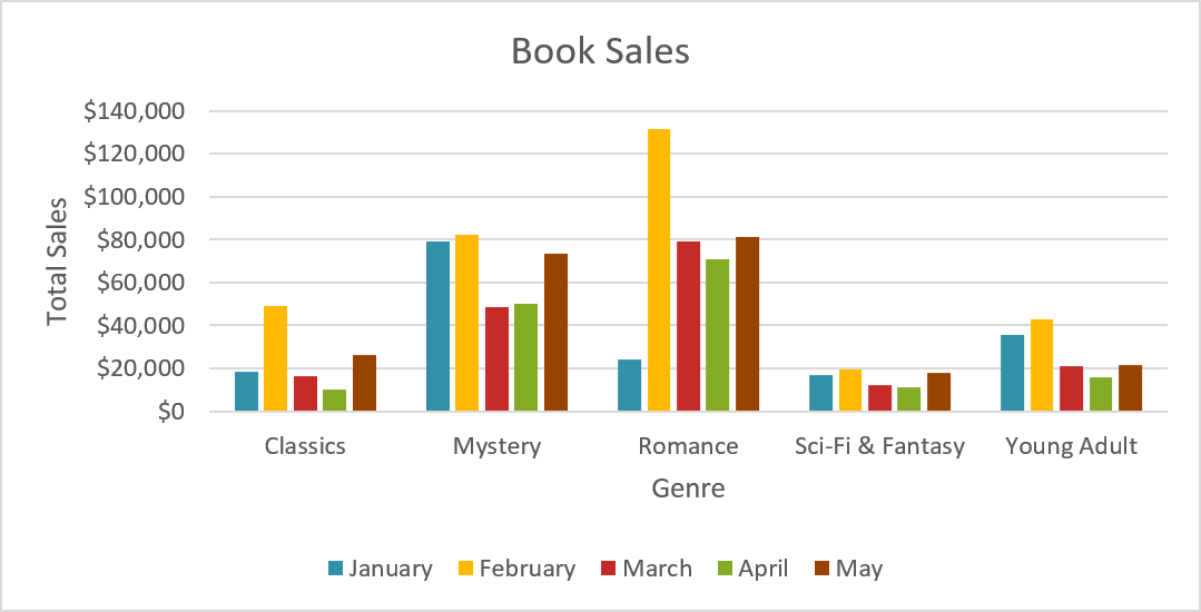
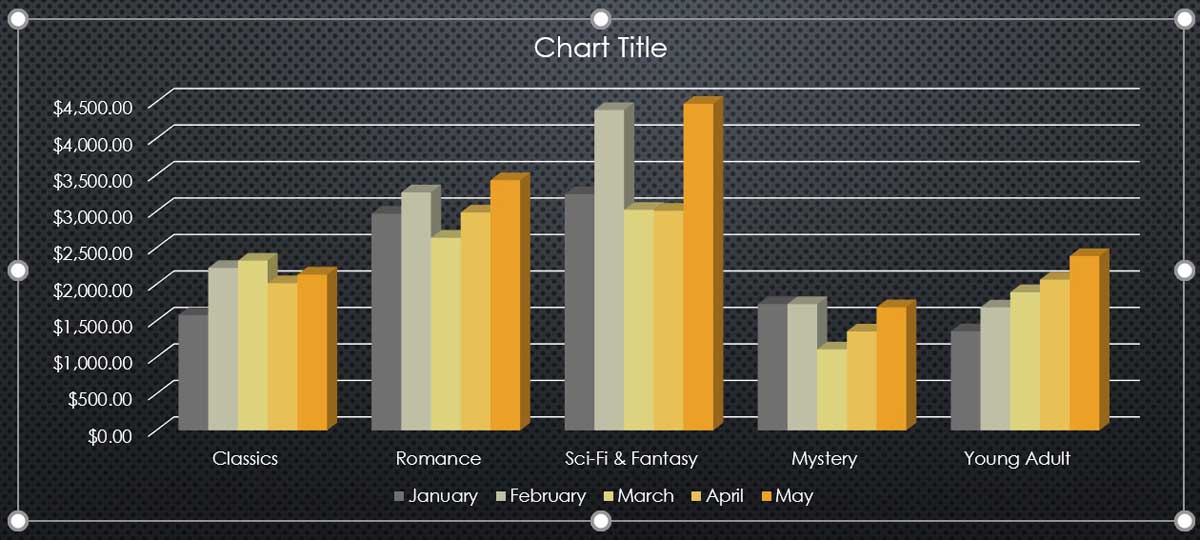
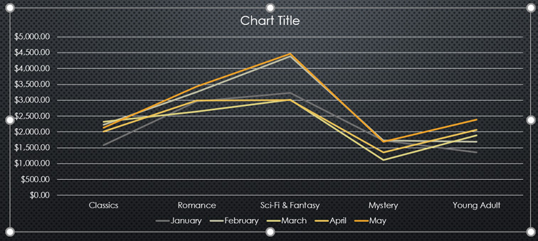
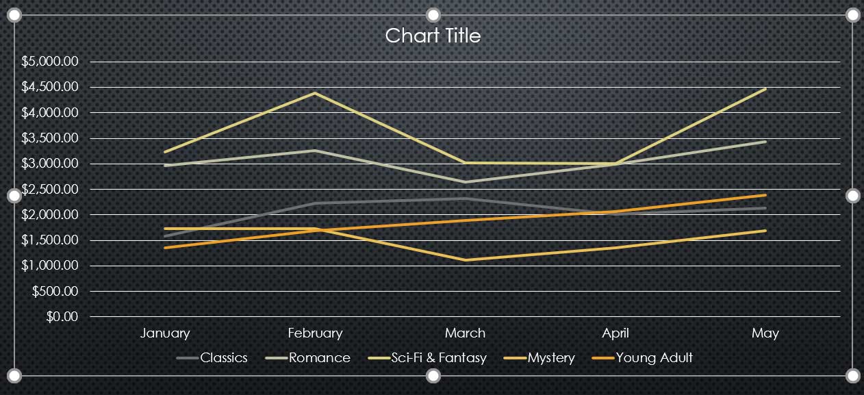
Sometimes, you may want to change the way your data is grouped. For example, in the chart below, book sales data is grouped by genre, with lines for each month. However, it is possible to convert rows and columns so that the chart will group data by month, with lines for each category. In both cases, the histogram contains the same data; it’s just organized differently.
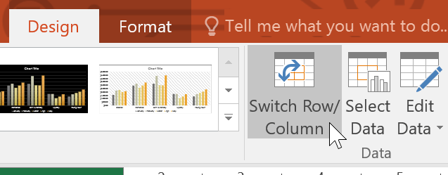
1. Select the chart you want to modify. Tab Thiết kế will appear.
2. From tab Thiết kếselect command Edit Data in group Data.
3. Click the chart again, then choose the command Switch Row/Column in group Data.
4. The rows and columns will be converted. In the example, the data is now grouped by month, with lines for each category.
Once numeric data has been entered in the first column of a spreadsheet, converting rows and columns may cause unexpected results. One solution is to enter an apostrophe before each number so that the spreadsheet formats it as text instead of a numeric value. For example, 2016 would be entered as ‘2016.
How to change chart layout
Predefined chart layouts allow you to modify chart elements – including chart titles, legends, and data labels – to make charts easier to read.
1. Select the chart you want to modify. Tab Thiết kế will appear.
2. From tab Thiết kếclick command Quick Layout.
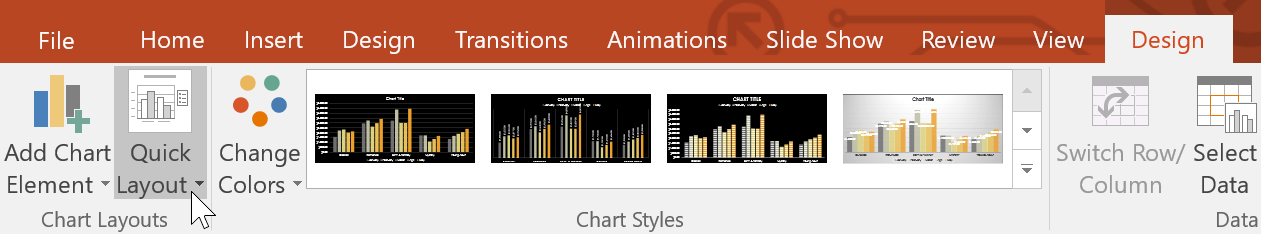
3. Select the desired predefined layout from the menu that appears.
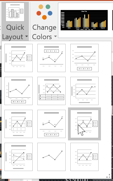
4. The chart will update to reflect the new layout.
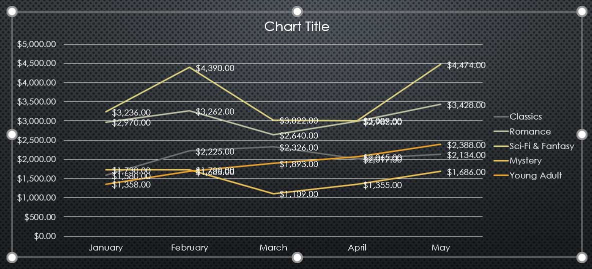
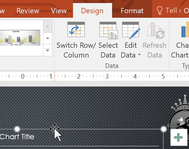
To change a chart element (like a chart title), click on it and start typing.

How to change chart style
Chart styles allow you to quickly modify the look and feel of your chart.
1. Select the chart you want to modify. Tab Thiết kế will appear.
2. From tab Thiết kếclick the drop-down arrow More in group Chart Styles.
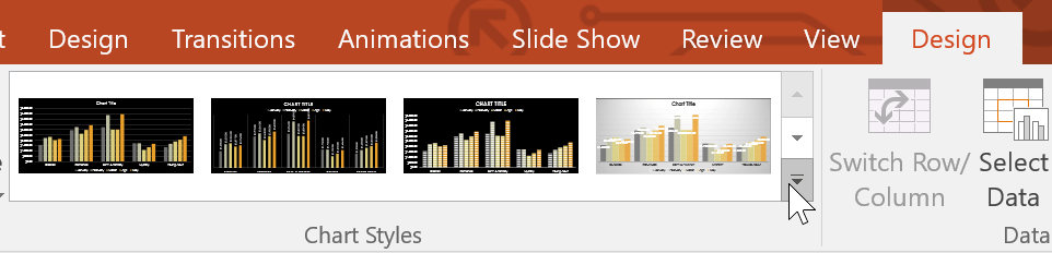
3. Select the desired style from the menu that appears.
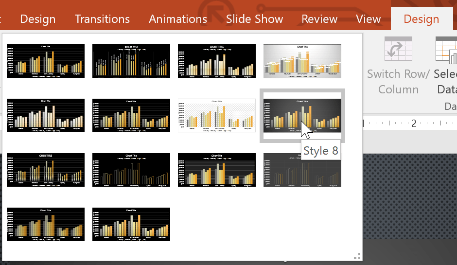
4. The chart will appear in the selected style.
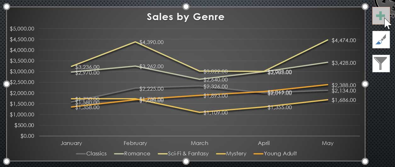
You can also use chart formatting shortcut buttons to quickly add chart elements, change chart styles, and filter chart data.
Source link: PowerPoint 2019 (Part 22): Charts
– https://techtipsnreview.com/