Google Slides is a great presentation tool with the ability to create complex slideshows. Google Slides’ easy-to-use interface and online sharing capabilities set it apart from other programs, and one of the many things you can create with Google Slides is charts.
To keep things simple, here’s how to create a chart in Google Slides, along with some basic graphic design tips to make sure you’re building the best data visualization possible.
How to create a chart in Google Slides
The first thing you’ll have to do is set up your slideshow, either by creating a brand new file or opening a document in progress.
If you have already created a chart outside of Google Slides, the process of adding one is also extremely simple. Just go in Insert > Imagethen place the image file in the presentation.
If you want to directly create a chart in Google Slides, there are a few more steps to take.
To create a chart in Google Slides, click Insert > Chart, then select the chart style that you want to include. For this tutorial, we will choose a very simple bar chart.
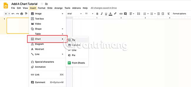
When you choose a chart style, Google Slides will include the pre-made chart in the slideshow.
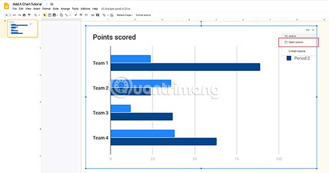
To adjust this Google Slides chart, click the drop-down arrow in the top right corner of this pre-made chart. Choose Open source. This will allow you to start editing.
Note: In this tutorial, we won’t talk about data collection, but just how to design charts in Google Slides.
If you are looking for a way to collect data for a chart, please refer to one of these 2 articles: How to create a Google Form form on Google Drive or How to create a website contact form using Google Forms.
Step 1: Learn about the Chart Editor
When clicking Open sourceGoogle Slides will take you to a pre-made Google spreadsheet.
In this spreadsheet, you’ll see columns that list the data points in the chart, along with the numeric values attached to them. You’ll also see a scaled-down version of the chart directly below that.
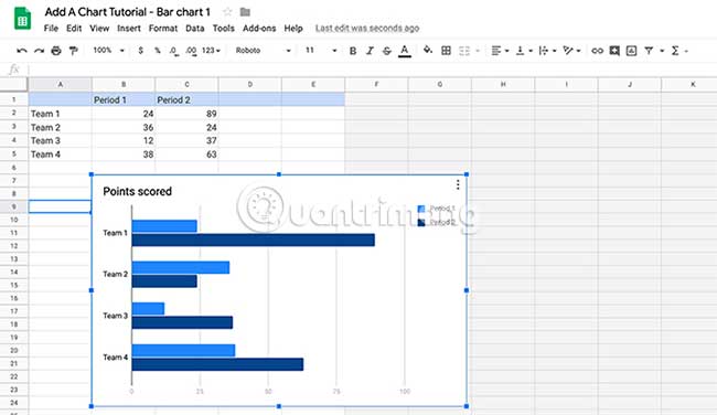
Double click this chart to open Chart Editor.
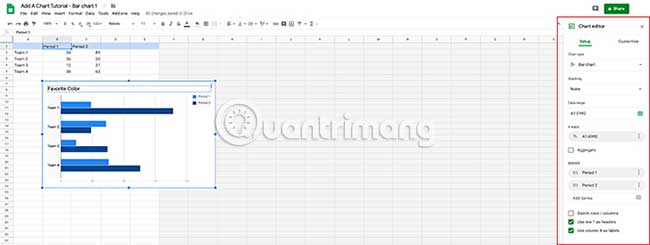
Chart Editor will open on the far side of the spreadsheet. In it, you’ll find two sections where the chart in Google Slides can be customized: Setup and Customize.
- Setup lets you control top-level data and design options for your charts, from Chart type (chart type), to Stacking and Data range (data range).
- Customize full of different drop-down menus where you can make adjustments Chart style, Chart & axis titles, Series, Legend, Horizontal axis, Vertical axis and Gridlines.
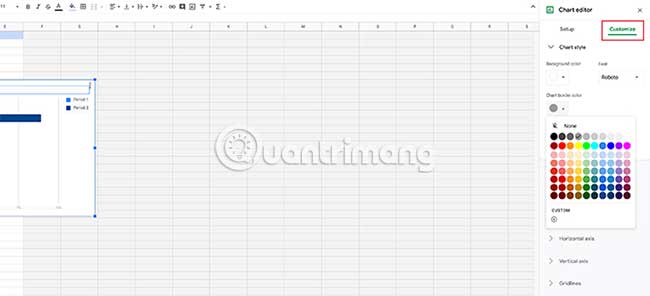
In a chart style (Chart style) specifically, you can adjust:
- Background color (Background color) of the chart.
- Color of the graph border (Chart border color).
- Font (Font) default for this chart.
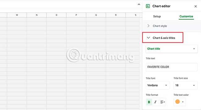
In Chart & axis titles, you can adjust the chart title. You can also change the font, size, format, and color for the title. Very simple, but quite useful.
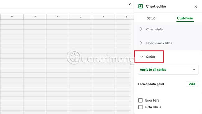
After completing the part Chart & axis titlesyou will find a drop-down menu Series. This is where you can format individual data points, useful when you want different colors on the chart to illustrate a point.
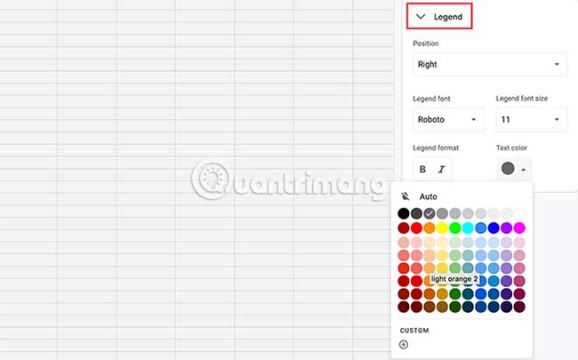
Next is Legend. This is where you can adjust the explanation for the data points and how they are displayed, including where they are on the page.
At the end you will come to 3 parts:
- Horizontal axis (Horizontal axis) controls how horizontal data points are displayed on the chart.
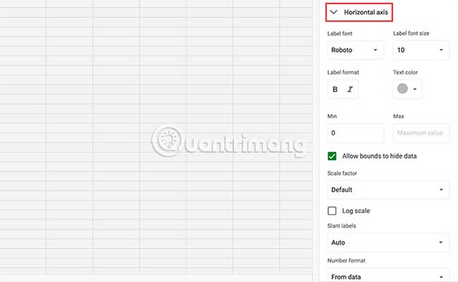
- Vertical axis (Vertical axis) controls how vertical labels are displayed.
- Gridline (grid lines) controls how the lines in the chart are displayed.
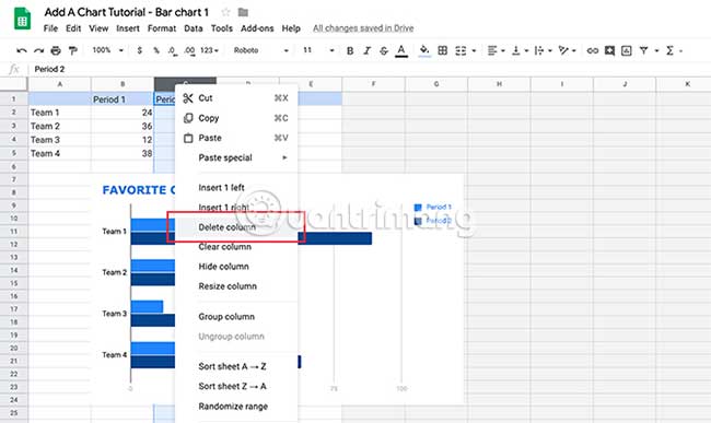
Step 2: Delete a column in the chart on Google Slides
Once familiar with Chart Editor, You will need to know some tips to customize this chart.
The article chose a default bar chart for my Google slideshow, but you may have noticed that each data point (for example: Team 1) has two separate bars. What if you only need one bar per point?
To remove a bar, go to the data points in the Google spreadsheet above the chart. Right click on the top of the column that says OLDto highlight the entire section containing the data you want to delete.
Click Delete column. This will automatically remove the entire column from the spreadsheet and update the previewed chart.
Step 3: Update the linked chart in Google Slides
When working on this chart in a linked Google spreadsheet, it’s important to note that the Google Slides presentation is still open in a different browser window.
If you return to that window and you want to see what this updated chart will look like, go to the upper right corner of the chart and click Update. Google will read the new changes on the spreadsheet and update the chart accordingly.
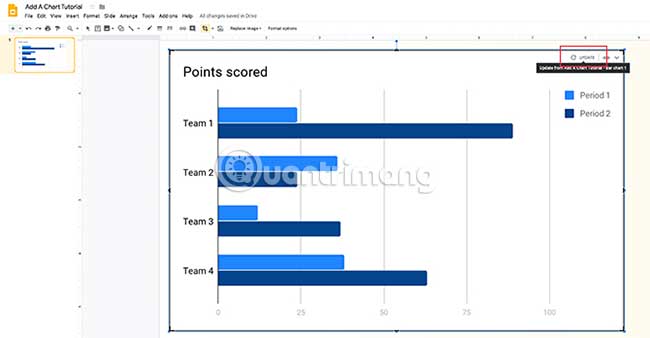
Return to Google spreadsheets to continue working.
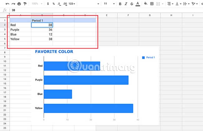
Step 4: Change the name and value of the data point
Another useful step is knowing how to change the names and values of the data points in the graph.
To change the name, go to the table in the Google spreadsheet above the chart. Double-click individual cells and start typing. Press Enter/Return after you finish entering.
Step 5: Change the color of the data point
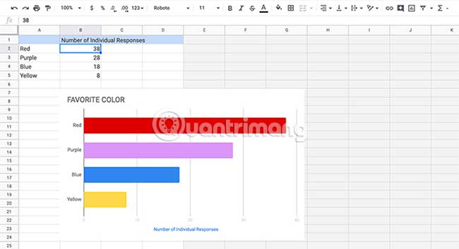
This simple bar chart has been basically completed, but it’s still pretty boring. One of the quickest and easiest things you can do is to make it stand out through color.
For this tutorial, the example decided to chart a favorite color based on the number of individual responses, broken down by category. What if we change each line on the bar chart so that they show color?
You can switch by going to Chart editor > Customize > Seriesthen click Add next to Format data points.

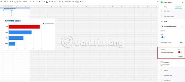
If you don’t like your data points to have individual colors, just remove (Delete) each individual data point in the Series.
If you want to add more colors just click Add once again. Repeat the same process with another data point.
Step 6: Move the chart legend
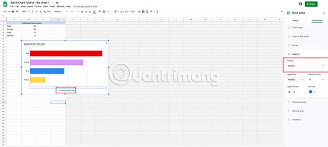
The last important step you need to know is how to move the legend of the chart.
No matter how simple or complex the data is, you’ll want to make sure the data you present is clearly labeled and easy to understand. For example, in this bar chart, the legend to the right makes no sense, especially since each bar is already a different color.
To move the legend around the chart, go to Chart editor > Customize > Legend.
In the drop-down menu Position, Select where you want to place the legend on the page. The legend is best placed under the chart.
Once you’re done customizing the chart, go back to the Google slideshow and update the view.
Design tips for creating a great chart
You now know how to create charts in Google Slides using Google Sheets as an additional tool. Next are some tips to keep in mind when displaying data. These tips can be applied to all the charts you create in Google Slides.
1. Make sure you use the correct chart type
The type of data you display will affect the type of chart you use, as different charts serve different purposes:
- Bar charts are suitable for grouped data.
- Line charts fit the data showing a trend over time.
- Pie charts are not recommended by statisticians. They are hard to read and often distort data. If you need to use pie charts, remember that they are used to show parts of a singular data point.
2. Object Memorization
You are designing a chart for the masses, who may have trouble deciphering complex data. It’s best to keep your diagrams simple and cut down on complex visuals, making connections faster.
3. Make things easy to see
Design your data in a way that’s intuitive and easy to grasp. Don’t put too much information in the chart that makes it hard to read, and try to cut out unnecessary visual elements, like decorative outlines, to make your data neater.
4. The importance of color
Use strong colors between different data points to make them stand out. Don’t use too many colors, or the chart can become confusing. Avoid combining red and green, as people with color blindness cannot see them.
5. Beware of flashy effects
Avoid 3D graphs or flashy effects. They are often difficult to read because 3D shapes can often distort the data you present.
Now that you know how to create a chart or graph in Google Slides, there are some design tips to create a great piece of work.
If you’re looking for other useful things you can do with Google Slides, here are some key Google Slides tips and tricks.
Source link: How to create a chart in Google Slides
– https://techtipsnreview.com/