![[Tuts] Instructions on how to draw a thermometer chart in Excel simply](https://techtipsnreview.com/wp-content/uploads/2022/02/Tuts-Instructions-on-how-to-draw-a-thermometer-chart-in.jpg)
Yes, I know the title may have surprised you a little Thermometer for measuring human body temperature is probably already known to all of us, but I believe many of you are hearing it for the first time. draw a thermometer chart in Excel right :D, simply because in Excel there is no such chart. This is an innovative way with charts to present data that is easier to see and manage.
Okey, don’t let you wait any longer, soon I will guide you in detail how to draw this type of chart. If you find it interesting, you can apply it to your work.
Read more:
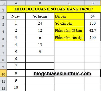
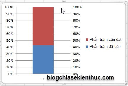
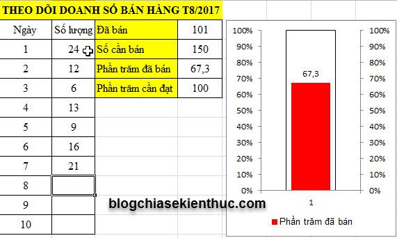
For example, I have a data sheet about tracking Sales in August 2017, the purpose is to see if the sales are achieved as planned or not.
Instructions for drawing thermometer charts
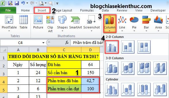
+ Step 1: Select the data area C4:D5, to enter Insert => Column, choose next 2-D Column
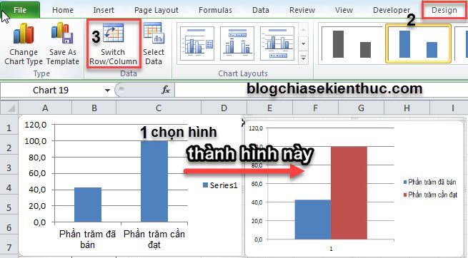
+ Step 2: After the image appears, do the following in turn:
- Left click on the image.
- Choose
Designon the Menu bar - Choose next
Switch Row/Colum
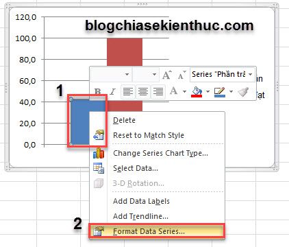
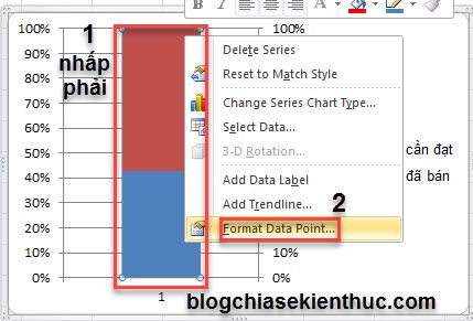
+ Step 3: Continue.
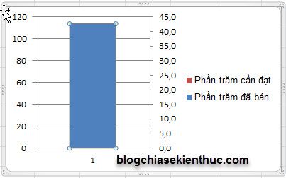
– Right click on Phần trăm đã bán (Column with small value)
– Choose Format Data Series as shown below.
– In the table Format Data Selection => you choose Secondary Axis in section Plot Series On
=> Result after selecting Secondary Axis, we get this image.
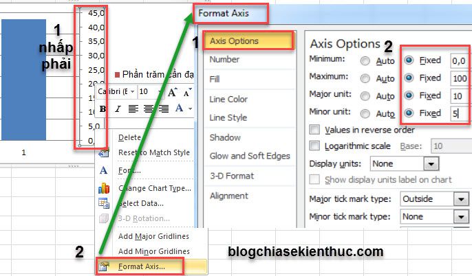
+ Step 4: Change the value of 2 columns left and right (see image below)
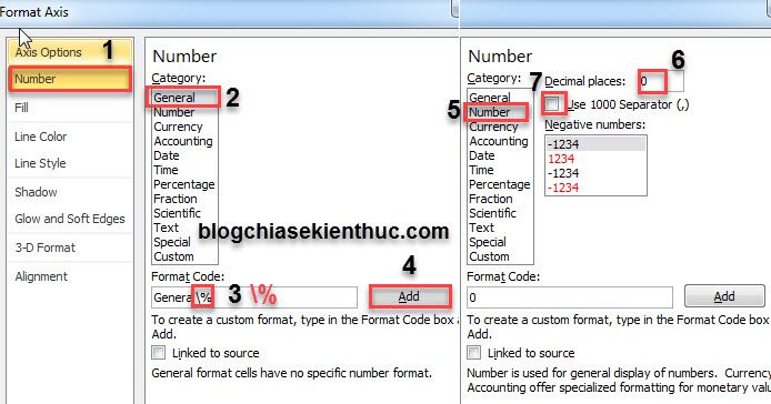
- Right click on the number sequence on the right.
- Choose
Format Axis
In Format Axis you set the following:
- Choose
Axis Options - Minimum: 0
- Maximum: 100
- Major units: 10
- Minor unit: 5
– If you want to display the number as 100%, adjust the value as shown below.
– Do it again Bước 4 With the left column we get the following figure:
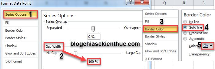
+ Step 5: Right click on the column Phần trăm cần đạt, choose Format Data Point
– In Format Data Point You set the following:
- Series Options: In Gap width choose 100%
- Border Color: Choose
Solid line(Color: Choose black)
+ Step 6: Choose the background color for the column.
- Percentage to achieve (100%): White
- Percent sold: Red
- Remove gridlines and add metrics to Percent Sold column for easy tracking
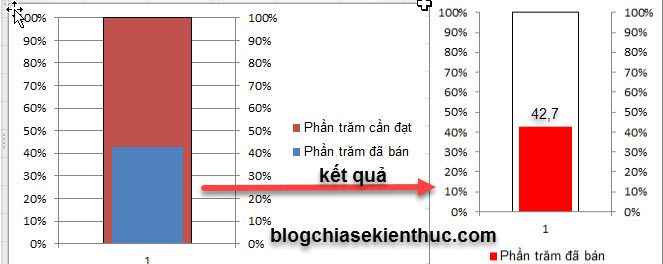
– Now when you add metrics to each day, "Nhiệt kế" Yours will automatically change accordingly.
Epilogue
Ok, so I’ve finished the tutorial for you how to draw thermometer chart in Excel okay then. The presentation through 6 steps seems long, but in fact it takes just over 1 minute if you have gone through the tutorials on drawing 2 charts on the same image of yourself in the previous articles.
Hope that you will enjoy this article and use this chart in your daily work.
Good luck !
Contributor: Nguyen Xuan Ngoc
Note: Was this article helpful to you? Don’t forget to rate the article, like and share it with your friends and family!
Source: [Tuts] Instructions on how to draw a thermometer chart in Excel simply
– TechtipsnReview