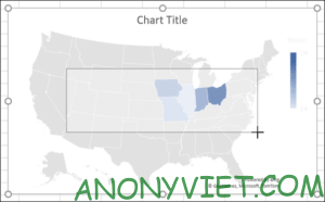
Charts are useful for visualizing your data. They can make data viewing and analysis easier, especially for your boss, colleagues (audience). So, for geographic data, the best choice is to use a map chart (as shown below) in Microsoft Excel.
| Join the channel Telegram belong to AnonyViet 👉 Link 👈 |
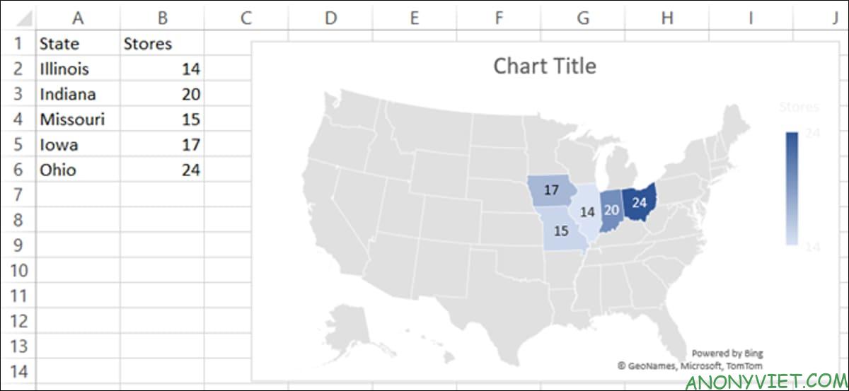
For example, if you want to show the population in certain countries or where the customer statistics are concentrated, you can create a map chart easily in Microsoft Excel. You can then format it with appropriate labels, legends, and color palettes.
Prepare data
As with other chart types in Microsoft Excel, it’s best to prepare your data in advance. This helps you quickly insert data into the chart.
Please select a unique data type for the map. Like the examples listed above, or, alternatively it could be your sales amount, number of stores, operating expenses, or other data you’ve prepared in your spreadsheet.
While you can use charts for smaller areas, such as cities, maps won’t be as effective. You’ll only see dots that represent those location types. Map charts in Excel will show you how best works for large areas like counties, regions, countries, and continents.
Create a map chart
When you are ready to create a map chart, select your data by dragging the cells, open the “Insert” tab, and go to the “Chart” section, then click “Maps” and select “Filled” Maps”.
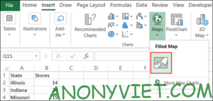
The newly created chart will appear right on your sheet.
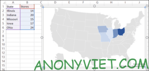
Chart Format
The next steps you’ll take are formatting the map, including useful components and color palettes. You can add a title, several labels, a legend, and a pattern.
Add title
If your map contains the default “Chart Title”, you can simply click on that text box on the map and enter your own title. If the map has no title, you can add a title easily as well as change its position as you like.
Select the chart and click “Chart Elements” (the “+”) on the right. Select “Chart Title”, then enter a title in the text box that appears on the map.
Hover your cursor over the arrow to the right of “Chart Title” in the Chart Elements box and choose a different location for the title if you want.
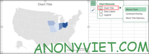
You can also select “More Title Options”. Here, you can choose the position, and then colorize or apply a border to the header.

Insert data labels
If the data displayed on the map is small enough, you may want to add data labels. They will display live data on each location of the map.
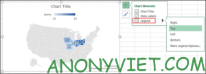
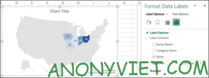
To adjust the text and options for data labels, select “More Data Label Options”. As with the chart title, the right menu opens with formatting features for the data labels.
Insert legend
An extremely important element of almost any chart is the legend. The legend is the key to the data displayed on the chart.
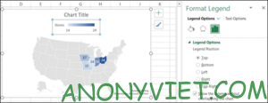
Select the chart and click “Chart Elements” on the right. Select “Legend”.
Hover your cursor over the arrow to the right of “Legend” in Chart Elements and choose a position for the legend.

You can select “More Legend Options” to open the menu on the right and format the text along with additional options.
Apply a style
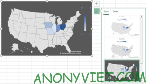
The atlas has a fairly basic color scheme, though you can make it stand out by decorating with different themes or color palettes.
Select the chart and click “Chart Style” (the brush icon under the “+”) on the right, and then click “Styles” to see the pre-made themes or “Color” to choose the color you like .
Move, resize, edit or delete a Map
You can easily move the chart anywhere you want on your worksheet. Just select and drag it to the new location. To resize the chart, drag one of the corners of the chart.
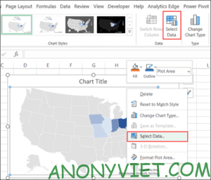
To edit the data displayed on the map, for example, if you add other locations, right-click the chart and click “Select Data”. You can also go to the “Chart Design” tab and click “Select Data”.
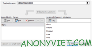
Enter cells in the “Chart Data Range” at the top, or drag your cursor over the cells. Click “OK” when you are done.
If you decide that you don’t want to use this chart anymore, you can delete it easily. Select the chart and press the Delete key or right-click and select “Cut”.
In addition, you can also refer to the Excel course for all ages here.
Source: How to Create a Map Chart in Microsoft Excel
– TechtipsnReview


