
In the process of using Word, Excel or PowerPoint, inserting graphs and charts into the content is a necessary job, this helps the content you want to present will be clearer, the types of data or Statistics are also displayed in a more understandable way.
If you are an office worker, a student, a student or even a teacher, but do not know how to draw a chart, that is one of the huge shortages.
Understand its importance. Today, within the framework of this article, I will guide you how to draw a column chart in PowerPoint and how to format them in the most standard way.
Read more:
Please follow closely and do it with me!!!
OK ! Let’s get started….
How to draw a column chart in PowerPoint?
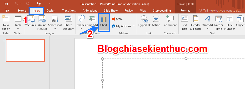
+ Step 1: Start PowerPoint up.
You open PowerPoint on your computer. From the main interface of the Menu bar => you click on Insert => then select Chart.
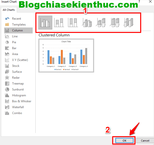
+ Step 2: Select the chart type.
After the dialog Insert Chart appear with different chart types. Please click to select the appropriate chart type and then click OK.
+ Step 3: The Excel data table appears.
A sample Excel statistics table will appear. This statistics table allows us to enter data for your chart.
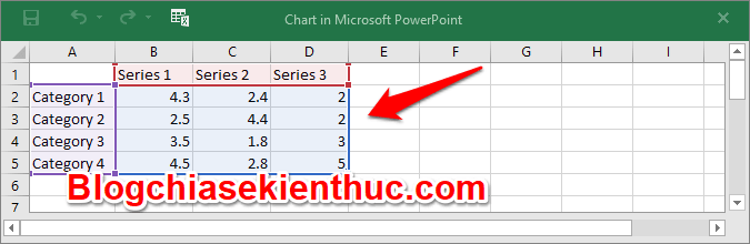
And now you can start entering the exact data you want to chart into the above Excel table. From the Excel table data, the chart in PowerPoint will be automatically drawn and filled with statistics.
After entering the data into the Excel table, the chart will be automatically generated as shown below.

+ Step 4: Change the data.
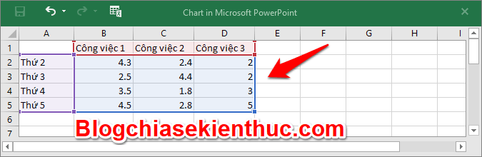
If in case the chart has been drawn and you want to change the data from the Excel table and redraw the chart, then right-click on the chart => and select Edit Data.
=> When changing data in Excel, the chart will be redrawn immediately.

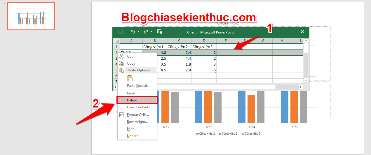
+ Step 5: Delete data from rows and columns.
In case you don’t just want to change the data but you want to delete a column of data or a row, then you left-click => and highlight the column or row you want to delete => then right-click and select Delete.
+ Step 6: Change the chart format.
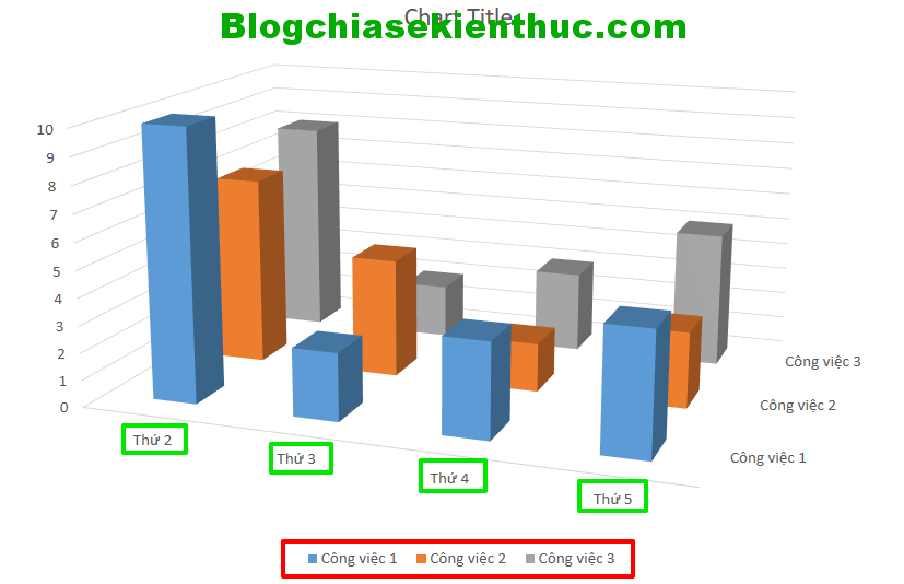
When you feel that the chart you have drawn is still not suitable, you can choose another chart format for it. You right click on the chart => and select Change Chart Type.

For example, here I have converted the chart to style 3 - D Column.
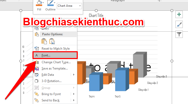
+ Step 7: Change the font, font format.
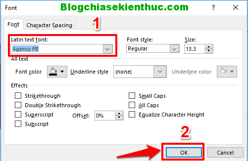
You want to change the font or change some text format, right click on the chart and select Font => Then choose an arbitrary font.
There will be 1 table Font The text appears, you change the Font in the section Latin text font and can make changes to some other font formats such as:
- Font color: Font color
- Font style: Font style
- Size: Font size
- Character Spacing,…
=> Then press Ok to save changes.
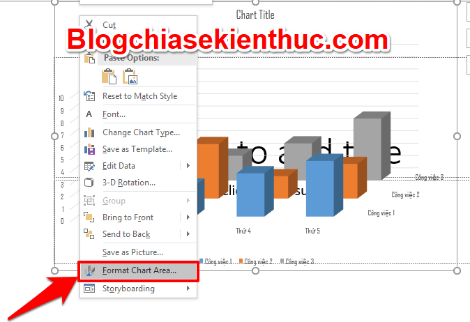
+ Step 8: Insert background image.
If you want to insert a background image into the chart to make the chart more intuitive and vivid, right-click the chart => select Format Chart Area.
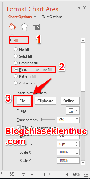
There will be a dialog box Format Chart Area appears for you to insert the background image.
- In the section
Fillyou choosePicture or texture fill. - Below section
Insert from=> you clickFileto select an image and upload it to the chart.
And here are the results, you can search for images with the topic you are trying to present to make it more relevant and beautiful.

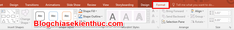
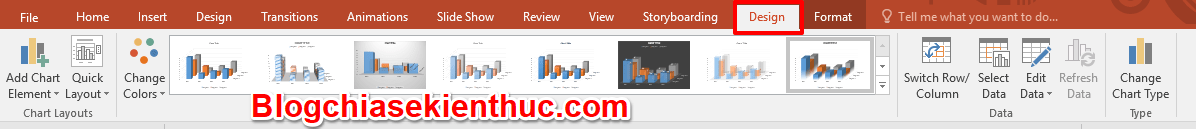
In addition, you can use some more editing and formatting functions in the tab Design and Format. Find out more for yourself!!! There are many more interesting functions
Epilogue
So I have finished guiding you with some basic steps in how to draw a column chart on PowerPoint and some ways to reformat the chart already. It’s that simple, isn’t it?
Thank you for following my post. Wish you have a productive and successful working day.
Friendly greet !!!
CTV: Phan Minh Sang – techtipsnreview
Note: Was this article helpful to you? Don’t forget to rate the article, like and share it with your friends and family!
Source: How to draw a column chart in PowerPoint is extremely simple and easy to understand
– TechtipsnReview